
As tensions escalated in Ukraine, more and more media organisations took to data visualisation to convey the actual state of affairs in the country. One of the arguments in the dispute over Crimea was the large number of people inhabiting the region for whom Russian is the native language. Here’s how different media organisation pictured it:


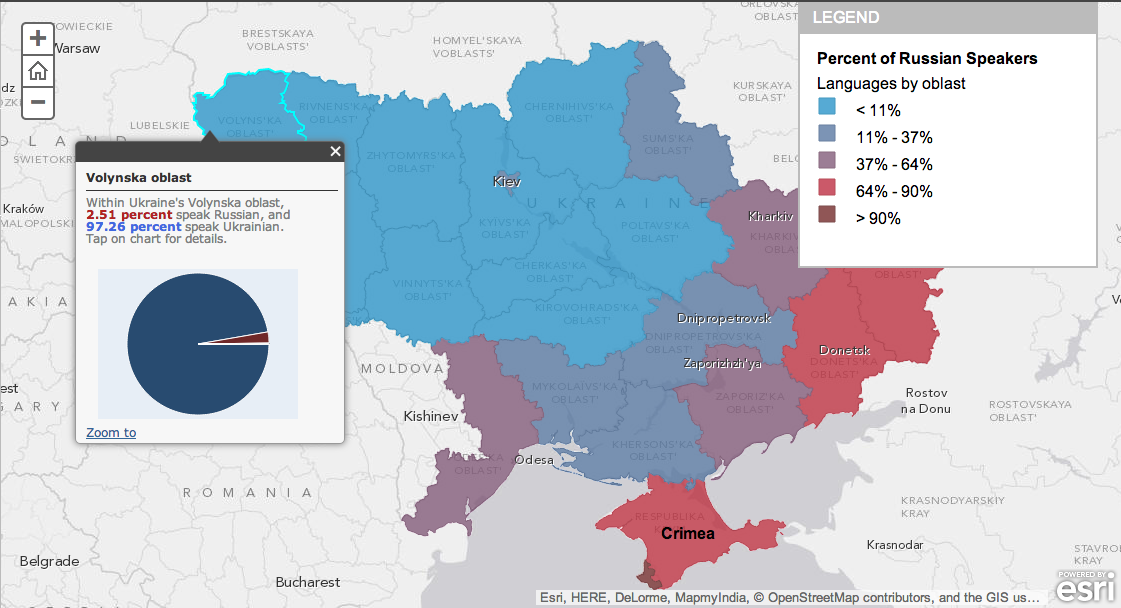
Non-media outlet map (the only interactive one, with a pop-out info-window):
 (This map serves only as a reference point for my comparison.)
Legends and Scales
Clearly, the maps differ significantly between themselves, mainly because of the different number of colour buckets and colour ramps they use. The Guardian opted for the simplest division into “Predominantly Russian-/Ukrainian-speaking” which maybe gives a clear picture of the most general trends, but it does not allow a more nuanced insights into the situation. Especially when compared to the interactive map, the Guardian’s one seems over-simplified. Upon exploring the detailed information in the pop-out window, it’s easy to spot that the territory corresponding to the the Guardian’s blue field does not have more than 10% of Russian speakers per region (with the exception of Sumska Oblast in the north). The distribution is therefore relatively even across the regions and legitimises using just one colour for this part of Ukraine. However, in the territory corresponding to the Guardian’s yellow field, only three regions have as much as 68-77% of Russian speakers, three have a +/- 50% share of them and further three a bracket of only 25-33%. This clearly shows that the Guardian’s take is correct but not fully accurately reflecting the linguistic divisions in the country.
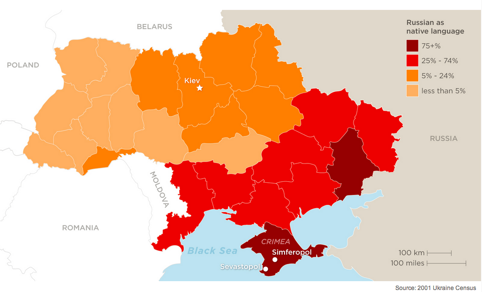
The CNN’s map is already a bit better in this respect but the choice of scale seems puzzling, with the bright red colour encompassing a rather broad bracket of 25-74% of Russian speakers. Adding another bucket (to make it 25-50% and 51-74%) would probably make the picture clearer and at the same time add the predominance factor to the map.
The NYT map on the other hand does not picture the whole of Ukraine, only its easternmost regions, where the tensions escalated in an especially violent way. What’s more the map is not explicitly showcasing the language division – it rather gives it as context to where the clashes took place. The scale it uses is definitely the most accurate one of all, but definitely not most readable (esp. against a greyish background, which sometimes intensifies the shades of blue). But all in all, it is enough to give the reader the general picture of the situation and therefore fulfils its function of background information.
Colours
In terms of colour ramps used, my personal preference is with the NYT, because the choice of sequential single colour scale is most suited to ordered data that progress from low to high.The same applies to the CNN map, which may even be considered better because the problem of colour opacity is not at issue.
The Guardian’s choice of Ukraine’s national colours is a nice pick, too. The choice of divergent scheme (two colours) emphasises the extreme ends of the scale (in this case the only two categories: Ukrainian/Russian) but – as mentioned above it fails to convey a more detailed picture.
Data
One more important aspect to touch on is also the source of data used for the visualisation. Unfortunately, only the CNN provided it for their map:
| Publication | Data source |
| CNN | 2001 Ukraine Census |
| NYT | not given |
| the Guardian | based on Washington Post map |
| StoryMap/Esri | not given |
However, it can be suspected that all of the media outlets based their stories on the 2001 census, since it is the only official data source available at this point of time. The problem with the data is that it’s 13 years old, and the current situation might be a far cry from what it was in the beginning of the 2000s. The question is: can therefore the language division be an argument in the case of the conflict in Ukraine?
Conclusion
It is difficult to assess which map did best. As mentioned above, each of them has some shortcomings and it should therefore be the purpose with which they have been created that decides about their usefulness for the reader. I think the most accurate one would be the StoryMaps/Esri one, but I do not particularly like the scale it adopted (accurate as it is). I think a clear milestones (e.g. <10%, 25%, 50%, 75% and >90%) would do a better job.
Hint: If you need a hand in choosing colours for your maps, check out Colorbrewer – it’s a nice little tool to solve all your shades and hues problems.
Hint 2: If you want to learn more about mapping, check out tutorials I listed here.
